Data_BigMac <- read.csv("https://calmcode.io/static/data/bigmac.csv")R Advanced
Note
Welcome to the Advanced R Tutorial webpage! This tutorial will cover some basic data manipulation and analysis techiniques that you will be using for this program and future jobs. These includes: export and import dataframe, libraries, and Exploratory Data Analysis(EDA).
1 Import and Export Data Set
1.1 Import Dataframe
You can either download a dataset to your computer and open it via a file path, or load it directly from an online link. For the purpose of our demonstration, we will download and load the dataset from an online resource.
TipTip
In your first semester of statistics class at GW, you will use read.csv() regularly to load in data files to R. Don’t forget it!
1.2 Export Dataframe
There are several output file types you can choose from when exporting a dataframe. We will export the dataframe into a .csv file in this example.
When exporting a dataframe, you will need to specify the file path on your computer so that R knows where to store the exported file. If you wish to follow along through the next example:
" my_documents_path <- file.path(Sys.getenv("USERPROFILE"), "Documents", "Data_BigMac.csv") "
" write.csv(Data_BigMac, my_documents_path, row.names = FALSE) "
the exported .csv file should be saved in this location: in your computer:
C:\Users\"insert your username here"\Documents
2 Libraries
Packages and libraries are additional functions or features developed by third-parties to make data analysis in R more efficient and support clearer visual interpretation of the data.
2.1 Install package and enable libraries
The syntax for installing a package is: install.packages(“the package’s name”)
# install.packages("dplyr",repos = "http://cran.us.r-project.org")
#install.packages("ggplot2",repos = "http://cran.us.r-project.org")
The syntax for enabling a library is: library(“the package’s name”)
suppressPackageStartupMessages(library("dplyr"))
suppressPackageStartupMessages(library("ggplot2"))
TipTip
We only need to install a package once and you do not need to do it again. It is a good practice to comment out the line of code where you install the package after the first time, especially if you are working on a project that you need to compile several times.
2.2 Other helpful packages
Predominant packages for R include: tidyverse, dplyr, ggplot2, psycho, and mice. We will use some of them in the next section, but first let’s install and enable them.
#install.packages("tidyverse",repos = "http://cran.us.r-project.org")
#install.packages("psycho",repos = "http://cran.us.r-project.org")
#install.packages("mice",repos = "http://cran.us.r-project.org")
#suppressPackageStartupMessages(library("tidyverse"))
#suppressPackageStartupMessages(library("psycho"))
#suppressPackageStartupMessages(library("mice"))
3 Exploratory Data Analysis
Exploratory Data Analysis (EDA) is an approach focused on understanding the characteristics of a dataset through statistical methods and visualization.
We will be using the big-mac pricing dataset we imported earlier as an example for the following sections.
3.1 Data cleaning and selection
Data cleaning and selection are typically the initial steps in EDA. In practice, most datasets you encounter will be large and may contain issues such as typos, missing values, or other errors.
3.1.1 Cleaning the dataframe
We can first start by cleaning all the messy data. This includes Null/NA values, misinputs, and in some cases, extreme values. There are multiple approaches for this, such as deleting the data or imputation (replacing them with median or mean), etc.
In this case, we will use the dplyr package to drop all the Null/NA values.
"Data_BigMac <- Data_BigMac %>% drop_na()"
We can also use mean or median to replace any missing or extreme values. Here is an example code snippet for you to get familiar with the syntax.
Data_BigMac$dollar_ex[is.na(Data_BigMac$dollar_ex)] <- mean(Data_BigMac$dollar_ex, na.rm = T)
Data_BigMac$dollar_ex[is.na(Data_BigMac$dollar_ex)] <- median(Data_BigMac$dollar_ex, na.rm = T)
We can also use the mice package to help us with more advanced imputations. Here is the syntax for a mice imputation function.
"head(nhanes)"
"imputed_data <- mice(nhanes, m = 5, method = 'pmm', print = FALSE)"
"head(complete(imputed_data, action = 1))"
3.1.2 Select the sections of dataframe
When we are working with a large dataframe, it is standard procedure to drop unnecessary data to save memory space.
We will be using the filter() function from the dplyr package in this example. Let’s filter out any country that has a dollar exchange rate lower than 2.
Data_BigMac <- filter(Data_BigMac, dollar_ex >= 2)
head(Data_BigMac)
date currency_code name local_price dollar_ex dollar_price
1 2000-04-01 CLP Chile 1260.00 514.00 2.451362
2 2000-04-01 CNY China 9.90 8.28 1.195652
3 2000-04-01 CZK Czech Republic 54.37 39.10 1.390537
4 2000-04-01 DKK Denmark 24.75 8.04 3.078358
5 2000-04-01 HKD Hong Kong 10.20 7.79 1.309371
6 2000-04-01 HUF Hungary 339.00 279.00 1.2150543.2 Data manipulation and statistical summary
3.2.1 Common functions to inspect a dataframe
It is routine practice to take a look at the actual data in the dataframe to have a better understanding of what we are dealing with. Functions like head() and tail() are a good start. You can also use dim() to know how many rows and columns there are for this dataframe.
head(Data_BigMac) date currency_code name local_price dollar_ex dollar_price
1 2000-04-01 CLP Chile 1260.00 514.00 2.451362
2 2000-04-01 CNY China 9.90 8.28 1.195652
3 2000-04-01 CZK Czech Republic 54.37 39.10 1.390537
4 2000-04-01 DKK Denmark 24.75 8.04 3.078358
5 2000-04-01 HKD Hong Kong 10.20 7.79 1.309371
6 2000-04-01 HUF Hungary 339.00 279.00 1.215054tail(Data_BigMac) date currency_code name local_price dollar_ex dollar_price
1027 2020-01-14 TRY Turkey 12.99 5.88025 2.209090
1028 2020-01-14 TWD Taiwan 72.00 29.88450 2.409276
1029 2020-01-14 UAH Ukraine 57.00 23.99000 2.375990
1030 2020-01-14 UYU Uruguay 179.00 37.43500 4.781621
1031 2020-01-14 VND Vietnam 66000.00 23176.00000 2.847774
1032 2020-01-14 ZAR South Africa 31.00 14.39100 2.154124dim(Data_BigMac)[1] 1032 6summary(Data_BigMac) date currency_code name local_price
Length:1032 Length:1032 Length:1032 Min. : 2
Class :character Class :character Class :character 1st Qu.: 15
Mode :character Mode :character Mode :character Median : 49
Mean : 13356
3rd Qu.: 280
Max. :4000000
dollar_ex dollar_price
Min. : 2.0 Min. :0.640
1st Qu.: 5.8 1st Qu.:2.239
Median : 18.6 Median :2.743
Mean : 5081.9 Mean :3.011
3rd Qu.: 102.0 3rd Qu.:3.591
Max. :1600500.0 Max. :8.312 3.2.2 Statistical summary of the dataframe
Statistical summary is another beneficial way to understand the data. We can use some built-in functions in R.
mean(Data_BigMac$local_price)[1] 13356.14median(Data_BigMac$dollar_price)[1] 2.742555max(Data_BigMac$dollar_ex)[1] 1600500min(Data_BigMac$dollar_ex)[1] 2.01sd(Data_BigMac$local_price)[1] 210191.9var(Data_BigMac$dollar_ex)[1] 64437296193.2.3 A simple regression example
Regression is one of the simplest and widely used data analysis tools. We will run an easy regression using the base R lm() function in the following example.
Note: This example is only to get you familiar with the syntax for running a regression, the result will not make sense at all!
model <- lm(Data_BigMac$local_price ~ Data_BigMac$dollar_price, Data_BigMac)
coef(model)
(Intercept) Data_BigMac$dollar_price
22881.616 -3163.425 summary(model)
Call:
lm(formula = Data_BigMac$local_price ~ Data_BigMac$dollar_price,
    data = Data_BigMac)

Residuals:
    Min      1Q  Median      3Q     Max
 -20855  -15566  -13547   -9406 3986672

Coefficients:
                         Estimate Std. Error t value Pr(>|t|)
(Intercept)                 22882      17811   1.285    0.199
Data_BigMac$dollar_price    -3163       5501  -0.575    0.565

Residual standard error: 210300 on 1030 degrees of freedom
Multiple R-squared:  0.0003209, Adjusted R-squared:  -0.0006496
F-statistic: 0.3307 on 1 and 1030 DF,  p-value: 0.5654
3.3 Data Visualization
Data visualization is another essential aspect of EDA. It is especially useful when you present your work to a larger audience.
In the following sections, we will go through a few prevalent graphs. We will be using the ggplot2 package in the example code.
3.3.1 Scatter plot
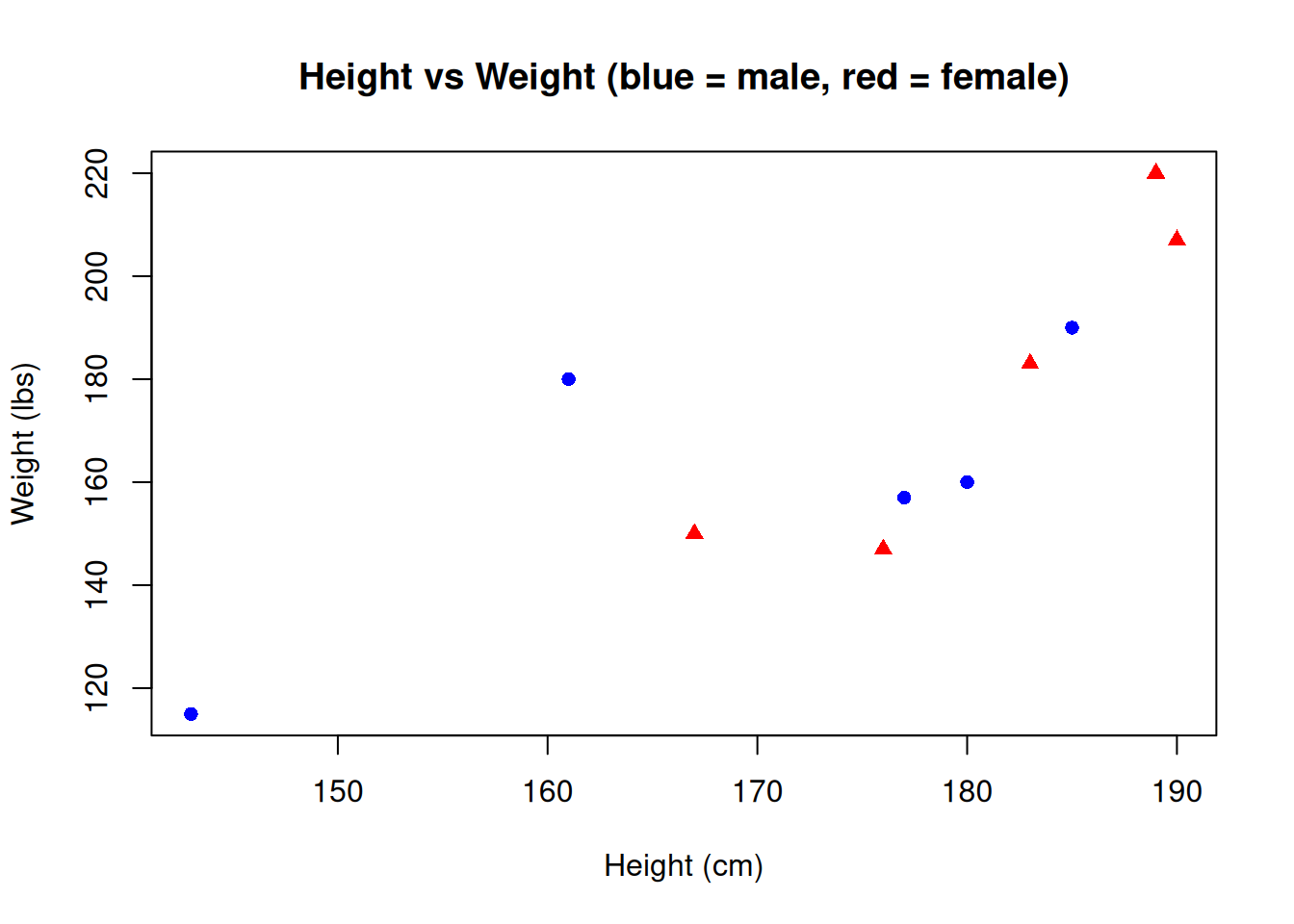
Scatter plot is best applied when you want to display the relationship between two sets of data. Here is an example dataframe and graph using ggplot2.
Gwu_Student_HW <- data.frame(
  height = c(177, 180, 190, 176, 161, 143, 189, 167, 183, 185),
  weight = c(157, 160, 207, 147, 180, 115, 220, 150, 183, 190),
  gender = c('male','male','female','female','male','male','female','female','female','male')
)
head(Gwu_Student_HW)
height weight gender
1 177 157 male
2 180 160 male
3 190 207 female
4 176 147 female
5 161 180 male
6 143 115 maleplot(
Gwu_Student_HW$height,
Gwu_Student_HW$weight,
pch = ifelse(Gwu_Student_HW$gender == 'male', 16, 17),
col = ifelse(Gwu_Student_HW$gender == 'male', 'blue', 'red'),
xlab = 'Height (cm)',
ylab = 'Weight (lbs)',
main = 'Height vs Weight (blue = male, red = female)'
)
3.3.2 Bar Chart
Bar chart is typically used for categorical data. Here is an example using base R.
Average_Rain_Volumn_by_Seasons <- data.frame(
  season = c("Spring", "Summer", "Fall", "Winter"),
  volumns = c(76, 33, 56, 21)
)
barplot(Average_Rain_Volumn_by_Seasons$volumns,
names.arg = Average_Rain_Volumn_by_Seasons$season,
        col = "steelblue", main = "Average Rain Volumn by Seasons",
        xlab = "seasons", ylab = "average rain volumns")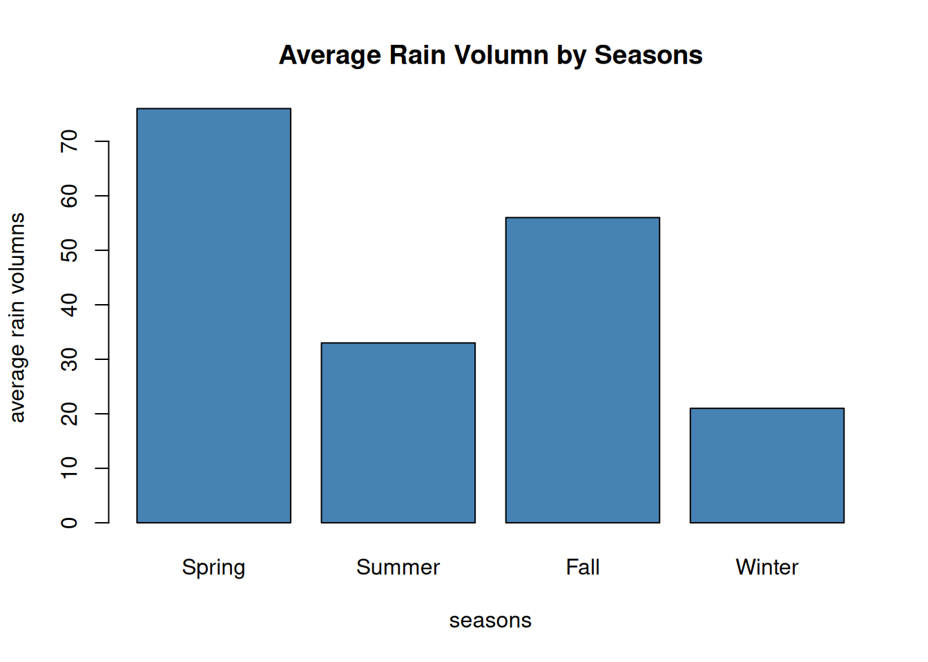
3.3.3 Boxplot
Boxplot is a great way to show how data is distributed. Here is an example using ggplot2.
GWU_Econ_Semester_StudenGPA <- data.frame(
  group = rep(c("Spring2024", "Fall2024", "Spring2025"), each = 20),
  value = c(
    rnorm(20, mean = 3.6, sd = 0.2),
    rnorm(20, mean = 3.4, sd = 0.3),
    rnorm(20, mean = 3.5, sd = 0.1)
  )
)
head(GWU_Econ_Semester_StudenGPA)
group value
1 Spring2024 3.853097
2 Spring2024 3.620653
3 Spring2024 3.585771
4 Spring2024 3.835464
5 Spring2024 3.499387
6 Spring2024 3.403021boxplot(
value ~ group,
data = GWU_Econ_Semester_StudenGPA,
col = c("skyblue", "palegreen3", "lightpink"),
notch = TRUE,
main = "GWU Econ Student GPA by Semester",
xlab = "Semester",
ylab = "GPA",
cex.lab = 1.1,
cex.axis = 0.9
)Warning in (function (z, notch = FALSE, width = NULL, varwidth = FALSE, : some
notches went outside hinges ('box'): maybe set notch=FALSE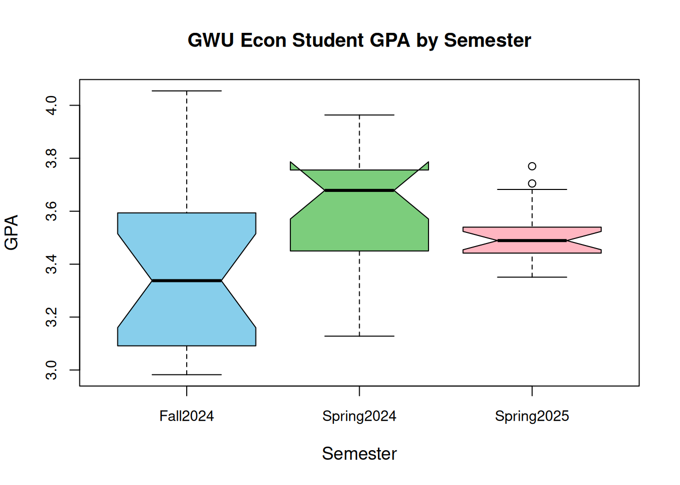
4 Interview Questions / Quiz Yourself!
NoteNote
On this page, you will find some interview questions to practice your advanced knowledge of R programming. All of the content is based on the R Advanced tutorial from this page.
Even if you are not preparing for an interview, these questions can help test your knowledge (perhaps for an upcoming exam, certification, or homework assignment!).
TipTip
Try to actively recall the answers before checking them. This is one of the most effective ways to learn and increase retention!
NoteQuestion 1: Which is NOT a function apart of base R?
A. dim(students)
B. var(movie_lengths)
C. drop_na(height)
D. is.na(homescore)
TipQuestion 1 solution:
C. drop_na() - This comes from the dplyr package!
NoteQuestion 2: Which of the following correctly selects a section of the dataframe tickets_sold?
tickets_sold <- ???
A. filter(tickets_sold, dollar_spent >= 150)
B. select(tickets_sold, dollar_spent$150)
C. filter(tickets_sold, dollar_spent === 150)
D. select(tickets_sold, dollar_spent{150})
TipQuestion 2 solution:
A. filter(tickets_sold, dollar_spent >= 150)
NoteQuestion 3: Which argument makes a scatterplot within ggplot?
MAYBE: Which of the following needs the + operator between components of the argument? A. geom_plot()
B. geom_point()
C. geom_splot()
D. geom_scatter()
TipQuestion 3 solution:
B. geom_point()
NoteQuestion 4: Which of the following correctly creates a boxplot using the data frame intern_gpa?
Assume intern_gpa contains two columns:
cohort (“Spring”, “Fall”, “Summer”) gpa (numeric values)
A. ggplot(intern_gpa, aes(x = cohort, y = gpa)) + geom_boxplot(), labs(title = “Boxplot of Intern Cohort GPAs”, x = “Cohort Season”, y = “GPA”)
B. ggplot(intern_gpa + aes(x = cohort, y = gpa)) + geom_boxplot() + labs(title = “Boxplot of Intern Cohort GPAs”, x = “Cohort Season”, y = “GPA”)
C. ggplot(intern_gpa, aes(x = cohort, y = gpa)), geom_boxplot() + labs(title = “Boxplot of Intern Cohort GPAs”, x = “Cohort Season”, y = “GPA”)
D. ggplot(intern_gpa, aes(x = cohort, y = gpa)) + geom_boxplot() + labs(title = “Boxplot of Intern Cohort GPAs”, x = “Cohort Season”, y = “GPA”)
TipQuestion 4 solution:
D. ggplot(intern_gpa, aes(x = cohort, y = gpa)) + geom_boxplot() + labs(title = “Boxplot of Intern Cohort GPAs”, x = “Cohort Season”, y = “GPA”)
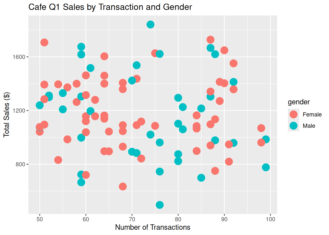
NoteQuestion 5: What needs to be fixed in this code snippet to avoid errors?
cafe_q1sales <- data.frame(
  total_sales = rnorm(100, mean = 1200, sd = 300),
  transactions = sample(50:100, 50, replace = TRUE),
  gender = sample(c("Male", "Female"), 50, replace = TRUE)
)
ggplot(cafe_q1sales, aes(x = transactions, y = total_sales, color = gender)) +
  geom_point(size = 5) +
  labs(
    title = "Cafe Q1 Sales by Transaction and Gender",
    x = "Number of Transactions",
    y = "Total Sales ($)"
  )
A. Need to specify cafe_q1sales to use when making the scatterplot.
B. Labels don’t need quotation marks around their titles.
C. Need another comma here: gender = sample(c(“Male”, “Female”), 50, replace = TRUE),
D. Replace must be false, not true.
TipQuestion 5 solution:
A. Need to specify cafe_q1sales to use when making the scatterplot.
4.1 Bonus: Create your own bar chart based off of this data frame!
school_acceptance <- data.frame(
  school = c("Yale", "GWU", "Georgetown", "UVA"),
  acceptance_ratepercent = c(4.5, 43.5, 13.1, 16.9)
)